The making of chrlsbr.me - Part 2: Design
The issue with procrastination is that it leads to a loss of motivation and eventually I end up forgetting what I wanted to write. Anyway here's the second blog post on making this website, focusing on the visual part.
Logo
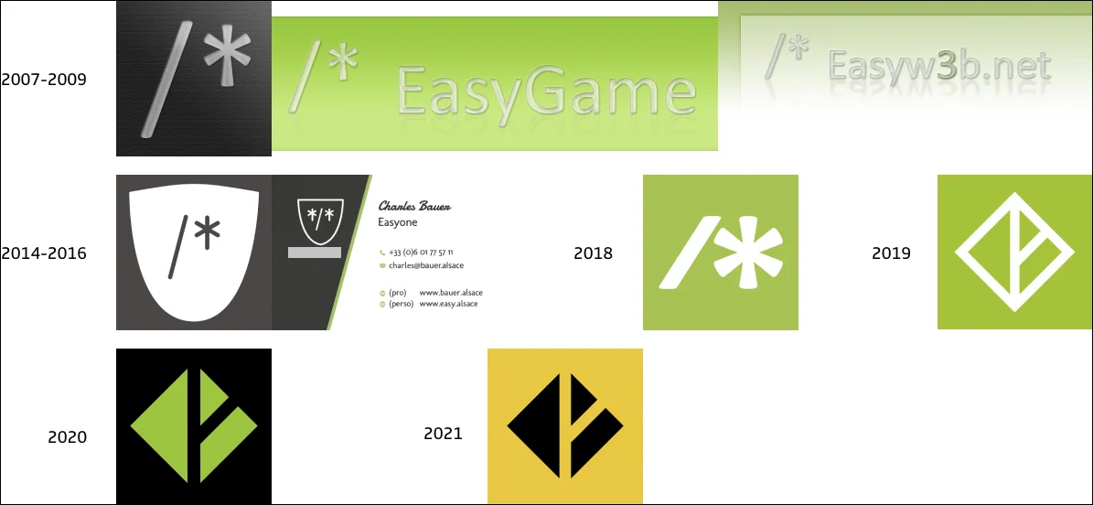
I first got Internet at home in 2003 and I started to get into web design a couple of years later. I created a first logo for myself around 2007 which I've been using mostly as an online avatar. It was the "/*" characters used to open a comment in CSS, set in Calibri, with some sort of a glossy aqua effect applied to the text, over a carbon textured background. Quite a ride, huh?
This logo evolved a bit around 2015 when I used some rounded font for the text and placed it inside a shield shape. In 2018 I removed the shield and switched to an extra-bold font, making the slash and the asterisk the same height.

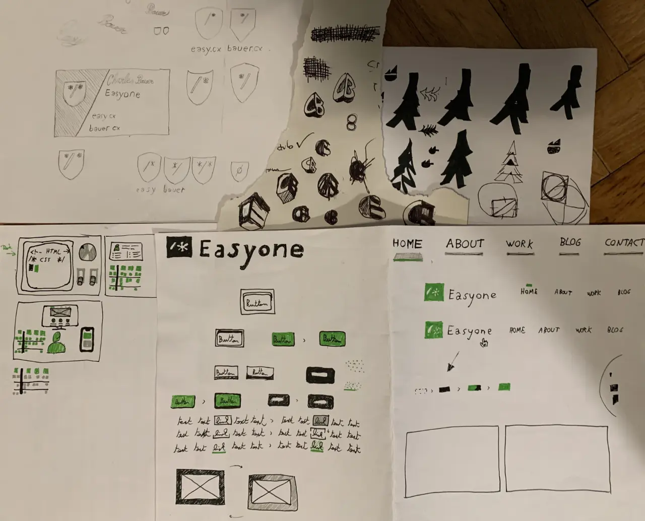
But it's in 2019 that I really started to try things out to find an identity of my own: paper sketches and scans, Figma files with dozens of variants, mockups of web pages… I spent quite a few weekends over the course of 2 years to explore different ideas. Featuring my initials "CB" and referring to nature and trees were some loose underlining guidelines.

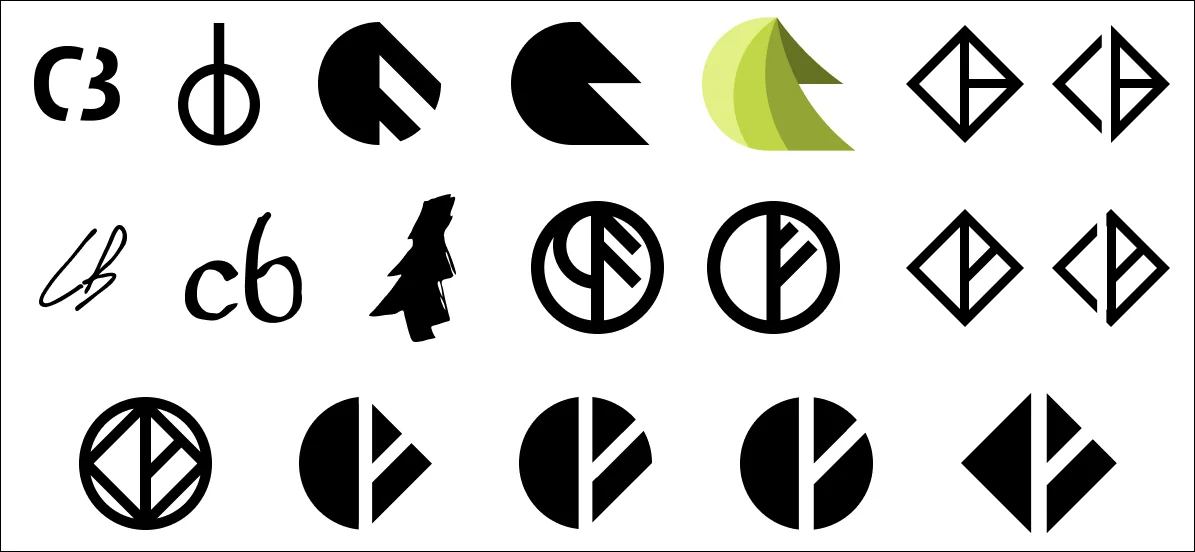
For the first iterations, ruling out the most uninspired options and the ones looking like penises, I was left with a few handwritten initials and some tree drawings. That was fine but neither unique nor exciting. The next iterations were heavily influenced by the logo curation done by Richard Baird on LogoArchive. The logos featured on the multiple issues use a single color and simple shapes but are bold and timeless, that's what I wanted.

Following this direction, I got a bunch of semi-circular logos, based on the idea of the combination of a round tree and a pine tree. I almost settled for this when I realized that the roundness of it all was somehow off, I needed something more angular. I think this happened when I've seen the logo of Rammstein attending a concert in 2019. I still wanted simple shades and one color, but with apparent corners. This led to the current version of the logo featuring all that I wanted:
a reference to my initials
a tree shapes with branches
very simple shapes and one color
bold and timeless design
Site design
Art direction
Compared to the 2020 version of the design, I wanted something more in line with the sobriety and simplicity I'm embracing. The result is something inspired by different influences:
- Simple visual artifacts like stripes, polka dots, dashes. Here I really like what Andy Bell and Heydon Pickering did with Every Layout, and also Heydon's website. I really enjoy the subtle polka dots pattern on Stéphanie Walter's website too.
- Low-tech vibe, like on the Low-Tech Lab or Gauthier Roussilhe's website. I'm talking especially about the dithering treatment applied to the images that I try to replicate here when it makes sense.
- Big serifs headings, I really like Rakesh's and David Hellmann's huge headings.
Layout
Again simplicity was the goal for the website layout. I've got a pretty wide sidebar next to the main content on desktop, holding the header and the footer. The proportions and vibe are inspired by Frank Chimero's website in early 2021. It seems he changed the design again since then so here's a snapshot from the Internet Archive.
Typography
I wanted to use uncommon typefaces that are not typically featured on Google Fonts. Ideally the work of independent type foundries or typographers. I also wanted to play around with variable fonts so the options were limited. Luckily I stumbled upon a font I really liked on v-fonts.com: Lembra. Originally I wanted to use some serif font for the body text and a display sans for the headings, but Lembra looks gorgeous so it would have been a pity to limit it to the headings. In the end I use Lembra from Fabio Haag Type as the main font for the body and utility text, combined with the serif Teramo from ROHH for headings. Since they are variable fonts, I could finely tweak the weights and display sizes of the different elements, neat!
Future evolution
I plan to keep this version of the design for a while and improve it progressively, as I feel the needs. The first step will be to change the homepage to make it more personal and playful, let's see.
It took me way to long to write this second part, but now that I'm done with it, I hope I'll manage to write more spontaneously in the future. I really wanted to finish this series of "making-of" article before I can really start blogging. I'm not sure what I'll talk about next but hopefully it will be soon!